

The S&P 500 hit new highs on Wednesday & is up more than 50% since bottoming in March. The unprecedented recovery in stocks has been driven by stimulus programs from the Federal Reserve & Congress. Looking “under the hood” of the S&P 500, the rally has been fairly concentrated:
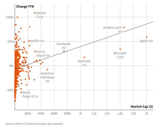
- Bigger is better: The S&P 500 is now up about 4.8% YTD, but only 40% of stocks within the S&P 500 are even up YTD. This speaks to the strength of mega-cap stocks like Apple and Amazon. On average, large-cap stocks within the S&P 500 are up 6% YTD vs. -6% for mid-caps & -40% for small caps! Below are a few interesting charts highlighting the relationship between market cap & recent performance.
- Sector Winner – surprise, surprise, it’s Tech: Tech is the best performing sector YTD and up 26%. However, on average the tech sector is up 9%. The divide in performance within the tech sector is another instance of large-cap stocks outperforming, which isn’t too surprising since most of the mega-cap stocks are indeed tech stocks. Tech now makes up ~28% of the S&P 500. To put this in context, this weight is nearly back to the Tech Bubble highs, where tech made up ~29% of the S&P. BUT! Amazon and Tesla are not in Tech. Amazon is consumer discretionary & Tesla isn’t in the S&P 500. So, even if we just look at Tech + Amazon, the weight would move to over 34%!
- Biggest divide? Consumer Discretionary: Another sector winner YTD is consumer discretionary, which is up 21%. Fundamentally – this is a little confusing. Global growth has been re-set much lower due to COVID-19, and consumer discretionary should be highly tied to the economy. Well, on average, Consumer Discretionary stocks are down 7% YTD. Breaking down consumer discretionary into its industries helps explain the disconnect. Online retail has had a stellar performance (not surprising, plus that captures Amazon which is up 78% YTD).
Why concentration matters: Do we care that the stock market rally has been concentrated? Historically narrow market breadth has meant below average market returns. Goldman Sachs analysts noted the narrowing proceeded recessions of 1990 and 2008, plus the economic slow downs in 2011 & 2016. The analyst also noted – when market leaders’ performance disconnects from their very high valuations, you often seen the market leaders ‘catch down’ to their weaker peers – though this is also often due to continuing weak economic conditions, which means economic data & policy stimulus is likely to remain very important for markets. Stock ownership becoming more concentrated is definitely worrying, because in up markets (like now), this only helps make the wealth divide larger.
Market Cap vs. YTD Return
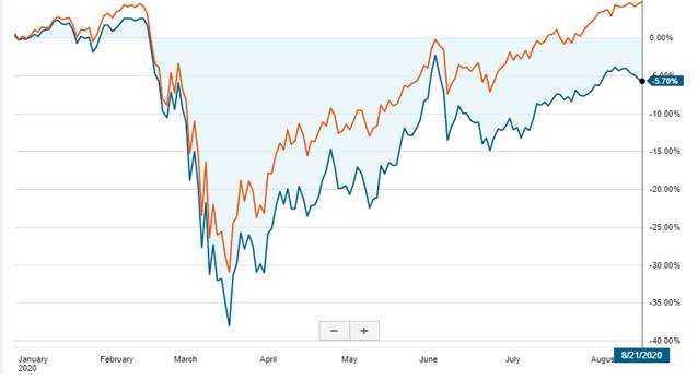
YTD Performance of S&P 500 (Orange) vs. S&P Equal Weight (Blue)
Since the S&P 500 is market cap weighted** (i.e. stocks with large market capitalization get a larger weighting) an easy way to see how large cap stocks have helped boost the market, is to look at the S&P 500 vs. an equal weighting of the S&P 500 (like ETF RSP).
Tech & Consumer discretionary are the top performing sectors YTD. However, they also have the biggest disconnect between the large caps vs. the overall sector, which you can see by looking at the market cap weighted return vs. the average return of stocks within the sector. Consumer discretionary really stands out here – on average stocks in the sector are down 7% vs. the sector being up 21% (thank you Amazon).
| YTD Returns by Sector | Weight in S&P | Mkt Cap Weighted Return | Average Return | Mkt Cap – Avg | Min | Max | ||||
| Info Tech | 28% | 26% | 9% | 17% | -49% | 106% | ||||
| Consumer Disc | 13% | 21% | -7% | 28% | -73% | 78% | ||||
| Health Care | 13% | 5% | 10% | -5% | -26% | 97% | ||||
| Consumer Staples | 7% | 2% | 1% | 1% | -66% | 49% | ||||
| Materials | 2% | 0% | -4% | 5% | -33% | 55% | ||||
| Industrials | 8% | -7% | -2% | -5% | -61% | 65% | ||||
| Utilities | 3% | -10% | -11% | 1% | -42% | 17% | ||||
| Comm. Services | 11% | -11% | 1% | -12% | -36% | 54% | ||||
| Real Estate | 2% | -12% | -16% | 4% | -56% | 34% | ||||
| Financials | 10% | -21% | -18% | -3% | -56% | 43% | ||||
| Energy | 2% | -41% | -43% | 2% | -67% | 11% |
Breaking down Consumer discretionary, the big winner is Internet. A lot of the other industries aren’t doing too well, which is more in line with a slowing economy due to the global pandemic.
| Industries within Consumer Disc YTD Return | Avg Return | Min | Max |
| Auto Components | -9% | -11% | -6% |
| Automobiles | -24% | -26% | -21% |
| Distributors | -13% | -13% | -13% |
| Diversified Consumer Services | -39% | -39% | -39% |
| Hotels, Restaurants & Leisure | -23% | -73% | 48% |
| Household Durables | 7% | -34% | 41% |
| Internet & Direct Marketing Retail | 27% | -18% | 78% |
| Leisure Products | -27% | -27% | -27% |
| Multiline Retail | -3% | -63% | 27% |
| Specialty Retail | 11% | -25% | 63% |
| Textiles, Apparel & Luxury Goods | -35% | -55% | 7% |
Glossary:
Index Weighted – Price vs Market Cap vs Equal: Index weighting simply means how much % holding each stock or security is in your index. In the example of the S&P 500 – you have 500 stocks. If you simply buy 1 share of each company the index is price weighted. This means the biggest % weighted companies in your index will be the highest price company. For example Amazon = $2000/60k = 3.3% vs APPL = $300/$60k = 0.5%. As we talked about above – prices / share are set arbitrarily. So it doesn’t make sense to weight more towards Amazon simply because their price / share is higher. What if we weight by how big the company is instead? This is called market cap weighted. Apple’s market cap is 1.38tn and amazon’s market cap is 1.01tn. Based on their market cap Apple is the largest company in the S&P 500 at 4.6% and Amazon is number 3 at 2.9%. Another way to weight stocks would be to simply make everything equal. So if there are 500 companies, each is worth 0.2% (100%/500).
Read More:
https://www.wsj.com/articles/when-the-stock-market-and-economy-seem-disconnected-11598002220?mod=hp_lead_pos7
https://www.reuters.com/article/us-usa-stocks-s-p500-graphic/big-tech-drives-sp-500-to-record-high-in-coronavirus-rally-idUSKCN25E2BO
Related Posts

Beginner Stock Trading Tactics for Post-Earnings Momentum
Earnings season is an exciting time for stock traders, as it can lead to…
Buying Earnings Winners in Structural Bases: The Cup-with-Handle Approach
Successful stock trading often involves identifying patterns that signal…
Demystifying Earnings Events: A Beginner’s Guide for Entry-Level Traders
Earnings events are significant market occurrences that can greatly impact a…
Your way of explaining all in this piece of writing is in fact nice, every one be capable of effortlessly understand it, Thanks a lot.
But wanna remark on few general things, The website style is perfect, the subject matter is very fantastic : D
Thank you ever so for your article. Nice dialogue.
Hello. This post was extremely fascinating, especially since I was browsing for thoughts on this topic last Wednesday.
This has been an extremely wonderful article
Some genuinely nice and useful information on this web site, as well I believe the style and design has good features.
I reckon something genuinely special in this web site.
Thanks a lot for the blog post. Really Cool.
Say, you got a nice article post. Really thank you! Cool.